Understanding Forex Charts
Forex charts are invaluable tools for traders in the foreign exchange market. These charts graphically represent the price movements of currency pairs over varying periods, empowering traders to analyze trends, pinpoint trading opportunities, and make well-informed decisions. For anyone venturing into forex trading, comprehending how to read and interpret these charts is essential.
Types of Forex Charts
Forex charts can be categorized into three main types, each offering a unique presentation of price data.
1. Line Charts
Line charts are the most straightforward type, connecting a series of data points with a line. They present the closing prices of a currency pair over a given time frame. Their simplicity makes them particularly useful for recognizing overarching trends. However, they lack detailed insight into price fluctuations within the specified period. This can be a limitation when more granular price action analysis is required.
2. Bar Charts
Bar charts provide more comprehensive data compared to line charts. Each vertical bar represents a specific time interval, such as a day. The top of the bar indicates the highest price achieved during that interval, and the bottom represents the lowest. Additionally, short horizontal lines on each side of the bar denote the opening price (on the left) and the closing price (on the right). Traders find bar charts valuable for a deeper understanding of price variations and market volatility, as they display a broader spectrum of data points.
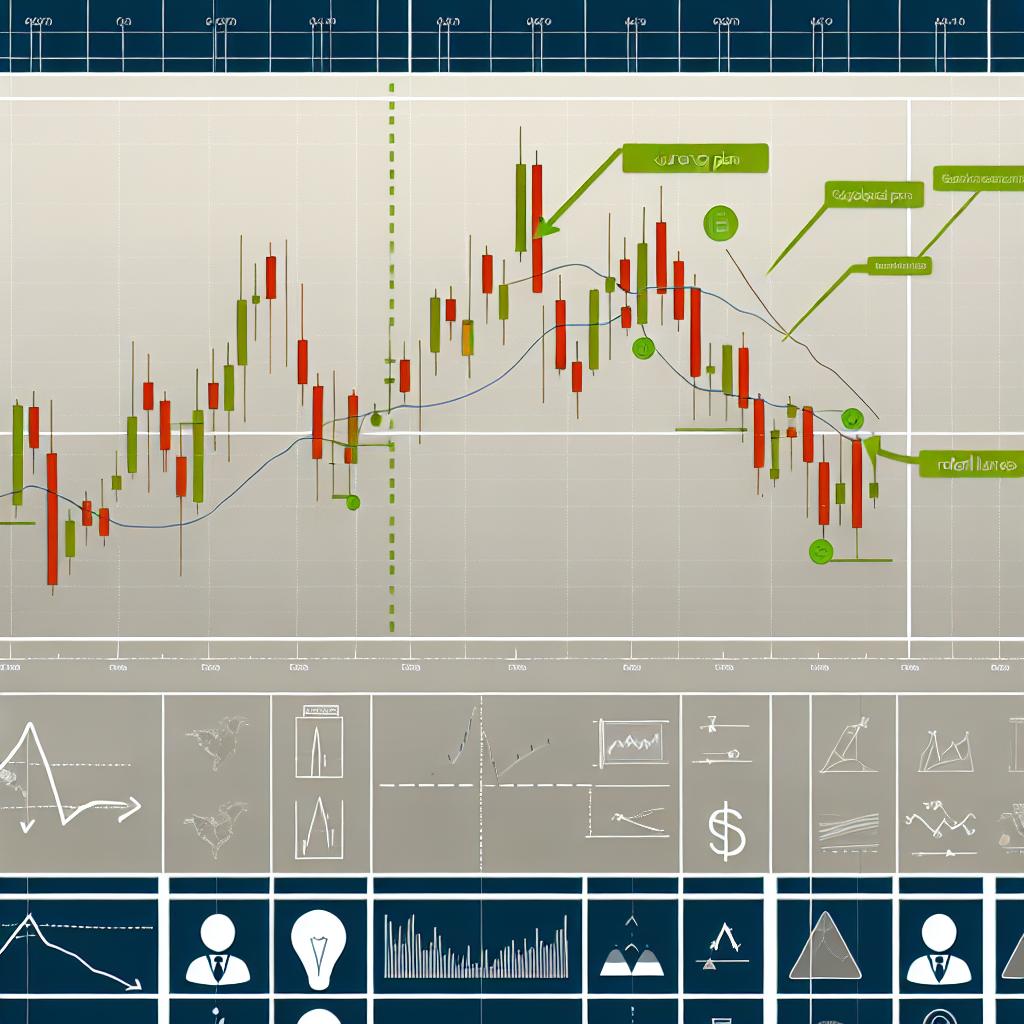
3. Candlestick Charts
Candlestick charts are favored among traders for their detailed and aesthetically appealing depiction of price movements. Each candlestick represents a particular period, capturing the open, high, low, and close prices. The body of the candlestick signifies the difference between the opening and closing prices, while the wicks or shadows demonstrate the period’s high and low prices. Traders can utilize candlestick patterns to predict future price movements, enhancing their arsenal for technical analysis.
Key Elements of Forex Charts
Several critical elements define forex charts, offering a structured way to analyze them properly.
1. Timeframes
Forex charts can be examined over various timeframes, spanning from as short as one minute to as lengthy as one month or even longer. The selected timeframe aligns with a trader’s strategy and objectives. For instance, day traders might opt for shorter timeframes to exploit rapid price shifts, whereas long-term traders may prioritize daily or weekly charts to assess broader trends.
2. Currency Pairs
Each forex chart pertains to a distinct currency pair, such as EUR/USD or GBP/JPY. The base currency appears first in the pair, while the second currency functions as the quote currency. The chart showcases how much of the quote currency is necessary to purchase a single unit of the base currency. Understanding this relationship is fundamental for analyzing the currency pairs’ price variations.
3. Price Levels and Trendlines
Price levels, including support and resistance, are horizontal lines drawn on the chart that mark vital price points where the market has previously reversed or consolidated. Support levels indicate where a downtrend is expected to pause due to demand, while resistance levels signal where an uptrend might pause due to supply. Trendlines, by contrast, are diagonal lines that connect consecutive highs or lows, facilitating the identification of the market’s direction and assisting traders in setting potential entry and exit points.
Using Technical Indicators
Forex charts often feature technical indicators to augment analysis and kinesthetic trading decisions. These tools provide extra insights into market trends and momentum, enhancing the trader’s analytical toolkit.
Moving Averages
Moving averages serve to smooth out price data over a predetermined period, assisting traders in identifying the overarching trend direction. Popular variations include the Simple Moving Average (SMA), which calculates the average price over a specific number of periods, and the Exponential Moving Average (EMA), which assigns more weight to recent prices, making it more responsive to new information.
Relative Strength Index (RSI)
RSI stands as an oscillator indicator that gauges the velocity and changes of price movements. It informs traders of potential overbought or oversold conditions, signaling possible market reversals. RSI values range between 0 and 100, with readings above 70 indicating overbought conditions and readings below 30 signifying oversold conditions.
Bollinger Bands
Bollinger Bands encompass a moving average flanked by two standard deviation lines. They play a critical role in identifying market volatility and potential breakout points. When price moves are confined within the bands, it indicates consolidation, whereas a breach often signals imminent directional movement.
Conclusion
Understanding forex charts is indispensable for any trader intent on navigating the forex market effectively. By mastering the diverse types of charts, key components, and technical indicators, traders can significantly enhance their ability to scrutinize market data and make informed trading decisions. Possessing this comprehensive understanding enables traders to strategize effectively and seize opportunities within the market dynamics. For further exploration into forex trading strategies and insights, seeking reliable resources or seeking the counsel of seasoned traders can be beneficial.
This article was last updated on: March 17, 2025